Contractor Website Examples: Five SystemsPal Designs
A contractor website has a few seconds to answer three questions: Do you do my kind of work? Do you work where I live? How do I get in touch? Here are five designs from our own work gallery, with the pages shown rather than imagined layouts.

On This Page
What these examples actually show
The images are desktop, laptop, tablet, and phone presentations of SystemsPal website designs. They show page design; they do not tell us how many calls or jobs a site produced. A portfolio image can show where information sits, but it cannot prove a conversion rate.
As you look through them, notice three things: the words a customer sees first, the kind of work pictured, and the route to contact. Then ask what the page needs to explain after that first screen. That is where a good-looking website can either become useful or leave the customer guessing.
BlueCurrent Pools and Spas: service and location on the first screen
The BlueCurrent design at the top of this article leads with “Expert Swimming Pool Contractor in Orlando.” A visitor does not have to decode a slogan to find out whether the business is relevant. A request form sits beside the opening message on desktop, while the phone layout gives the headline and contact action their own space.
The useful choice here is specificity. Pool work and Orlando are immediately visible. But “pool work” can mean a new build, renovation, or routine service. Somebody considering a large backyard project will want to see relevant finished work, understand what the company handled, and learn how an estimate begins. That belongs in the supporting pages and project examples, not in another paragraph about “quality workmanship.”
There is also a practical question about the form. It is prominent, but a customer may still want to see projects before sharing their details. A page should let the considered buyer keep exploring without losing the contact route.
TrueLine Fence: show which fence jobs belong here
The TrueLine Fence design puts “Fence Contractor in Kansas City” beside a short service description and a request form. The outdoor photograph gives the visitor a recognizable setting. On the smaller screens, the contact action remains available without squeezing the entire desktop arrangement onto a phone.

A fence company may handle repairs, full replacements, privacy fences, gates, and different materials. Those are not interchangeable requests. A homeowner with a leaning gate should be able to find out whether a small repair is in scope before completing a quote form. A homeowner comparing new fence materials needs photographs and explanations relevant to that choice.
A useful project entry would say what was built, what problem the old fence presented, why the material was chosen, and what the finished boundary looks like in its setting. A gallery of finished fences with no context may look attractive but makes the customer do the explaining. The website design article goes deeper on how evidence supports the decision to get in touch.
Harbor and Hearth Remodeling: the image starts a longer sale
Harbor and Hearth Remodeling opens with a finished interior and a Charlotte-specific headline. That is a useful start for someone considering a substantial project: the category is visible, the location is clear, and an estimate request is nearby.
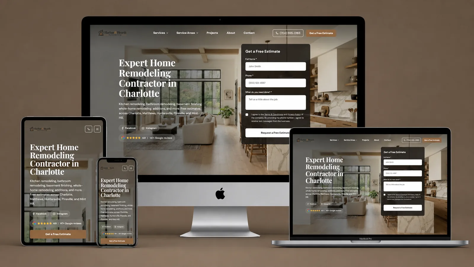
A remodeling customer is unlikely to decide from the hero alone. They need to know whether the company handles a kitchen, a bathroom, a whole-home renovation, or the particular scope they have in mind. They may also be trying to understand what happens before anybody can give a credible price.
The next pages should carry that weight. A project story can show the starting room, the homeowner's aim, a meaningful constraint, a decision made during the work, and the finished result. Those details tell the reader more than an anonymous photograph of a beautiful kitchen. They also help the contractor attract projects it actually wants.
The first screen introduces the company. The project story earns the request for an estimate. An appealing interior image should not stand in for proof of the company's own work.
Copperline Electric: make a broad trade navigable
The Copperline Electric design names the trade and Phoenix immediately. A homeowner arriving from a local search can see both without hunting through the menu. The estimate form is prominent on desktop and retained in the phone presentation.

“Electrical contractor” still covers very different needs. A customer with an urgent fault does not have the same question as someone planning a panel upgrade or outdoor lighting. A strong electrical site can use the main page as the introduction, then give each major service a page that explains the next step in everyday language.
For a panel-upgrade page, the customer may need to know what an assessment involves and which property details are useful for the first conversation. They should not have to diagnose the electrical system or pick a technical solution from a menu before the business will reply. For a repair page, clarity about contact and availability is more pressing than a long account of every service the company has ever offered.
The lesson from this example is not to add more terminology above the fold. It is to make the right service easy to find after the visitor recognizes the business as relevant.
LumaClean Home Services: help customers choose the right visit
LumaClean's Austin design uses a bright residential scene, a direct cleaning-service headline, and a visible estimate request. The customer can understand the broad category and location quickly.

Cleaning customers often need one more distinction: is this a one-time deep clean, a recurring service, a move-out job, or something for a commercial property? Those requests differ in scope, frequency, and what the company needs to know before quoting. A clear path for each helps the customer describe the right job and keeps the office from sorting everything from scratch.
If a cleaning business serves both homes and workplaces, showing only a residential interior may unintentionally tell commercial buyers that they are in the wrong place. Separate service pages can answer each audience with the right examples and next step. For recurring work, the site should also explain how customers discuss frequency, access, and scope before anyone promises a price. A regular visit is not the same sale as a one-time clean.
What the five designs have in common
Each first screen makes the trade, location, and inquiry route visible. That is valuable. It is also only the start. A contractor website has to take a person from recognition—“this may be the right business”—to enough confidence to make contact.
| Visible in the website image | Needed deeper on the site |
|---|---|
| A trade and city in the headline | The exact services and areas the team covers |
| A photograph that sets the scene | Real project evidence and a description of the work |
| An estimate form | A response process when the request arrives |
| A phone presentation | Readable detail and working contact controls on a phone |
There is a useful limitation to admit about a screenshot. It cannot tell you whether the form works, whether calls are answered, how quickly a customer hears back, or whether an estimate is followed through. Those things happen beyond the first screen. Our website conversion article looks at the gap between an interested visitor and a real conversation.
It also cannot tell you whether a page attracts the jobs the business wants. A pool builder should not celebrate a flood of maintenance requests if it only takes construction projects. A remodeler does not need every homeowner who wants a one-hour repair. Service scope and page copy decide whether the interest is useful.
Look at the phone version as a customer would
The device presentations make an important point: shrinking a desktop design is not the same as designing for a person on a phone. The visitor may be standing outside, comparing businesses between appointments, or trying to call before a problem gets worse. They should not have to zoom into a paragraph or hunt for a tiny menu to find the service they need.
Check what remains visible when the screen is narrow. Is the city still legible? Does the contact action do what its label promises? Can the visitor see a relevant project without scrolling through an entire desktop-sized form first? If they send a request, does the business know where the message goes and who replies?
A screenshot can show the layout at one width. The real test is whether those actions work on the live page. That is why the mobile presentation is a starting point for evaluation, not a certificate that the whole customer journey is complete.
Three ways an attractive page can still fail
Imagine a roofer's project gallery with twenty finished roofs and no descriptions. The visitor cannot tell whether the images show repairs, replacements, or new construction. A handful of explained projects would do more work than an endless gallery.
Or imagine a plumber's phone page with a button marked “Call now” that opens a general form instead. The homeowner with water below the sink wanted to speak to somebody. The interface promised one action and delivered another. That breach may matter more than the color of the button.
Finally, imagine an HVAC site that puts a quote form before it explains the difference between repair and replacement. The business gets a name and number but no shared understanding of the request. The team still has to sort out the job when it responds. Our HVAC marketing article shows why those inquiries need different conversations.
These are reasons to give each visual and control a job in the customer's decision. Good design is what makes the useful information easy to find and act on.
What to take from these examples
Choose the example closest to the decision your customer is making, not simply the color scheme you like. A pool build and an electrical repair can both use a polished website, but they ask different things of the visitor. The page should reflect the service you want to sell, the evidence you can show, and the promise your team can keep after contact.
SystemsPal builds contractor websites around those choices and connects inquiries to the people who will respond. You can see more designs on Our Work.
Book a Call and tell us which jobs your current website should bring in. We'll look at what customers see now and what your version of this page needs to make clear.